Attracting Customers With Skills and Values
I think, how we found and selected the design studio we are working with is an interesting example of how values and value-matchings matters; and also how “competition”, particularly comparing with alternative vendors can be a total non-concern when a buyer makes a buying decision.
It was an early and undisputed decision that we wanted to have a high quality visual identity design for TightOps. While we were working and discussing the first ideas of our products and how we wanted them to be presented, design was a key consideration.
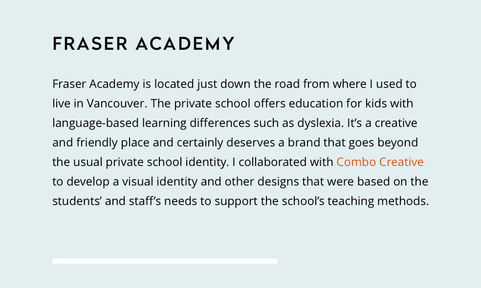
A few months back, I was writing a consulting proposal. The font we had been using for years in such pagespeed.io documents is Open Sans. In an attempt to provisionally pimp up that old look, I was wondering if we should not at least use a different font for headings. A web search for some inspiration brought me to this page with some “Open Sans Font Pairings”. This is where my eyes caught this little sample:
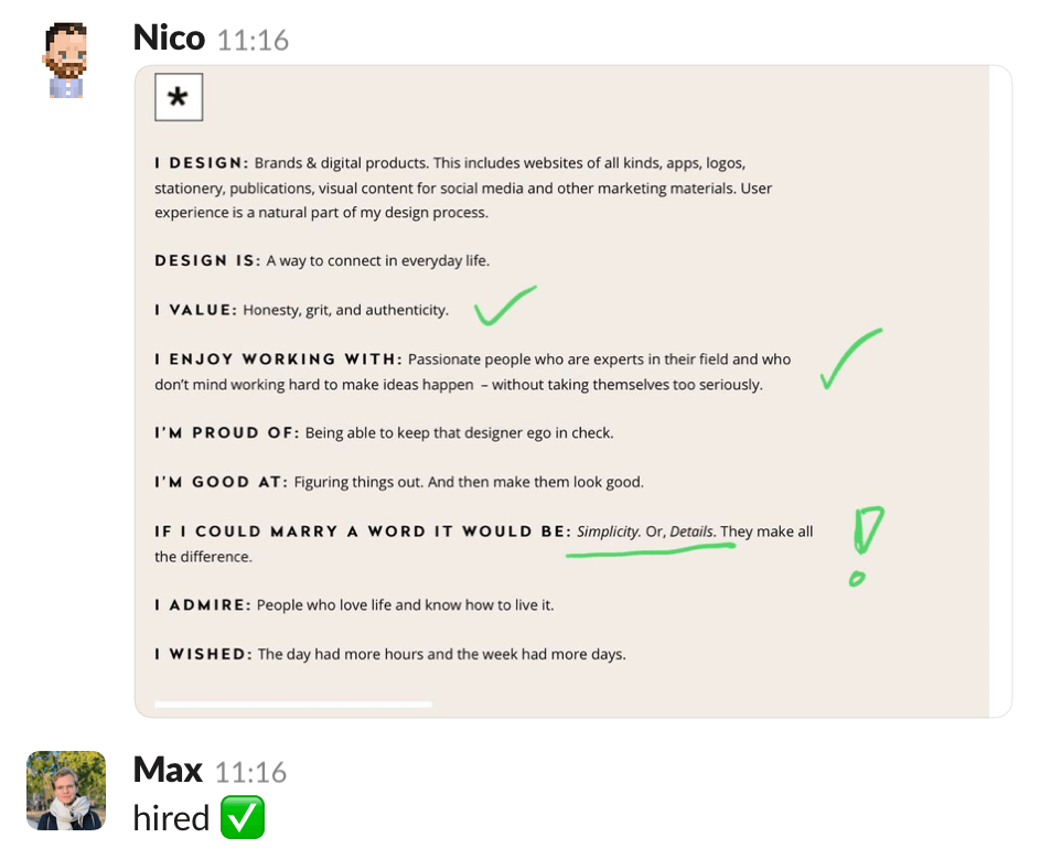
I clicked through and read the responsible designer’s profile (Christina Lauer). Seconds later I was on Christina’s website, browsing through her portfolio to get an impression of her general style and approach. Then I spotted the “Client resources” button on the top right of the page. This is where she got me.
The selected resources matched my/our understanding, values, and appreciation for good work. I found a few new things, and a few known ones which I agree with very much. I also liked the general layout and careful curation of that page.
After explaining where I found it, a few additional messages, less than 25 minutes later, we had arrived at this: 
While we were certainly not entirely serious or had made a decision at this point, we continued with our current work for a few weeks. When we started to develop a better and more concrete idea, we began to work on our “Brand Asset Briefing” document, defining what TightOps is about and what it should stand for. This was quite a laborious process with lots of drafting, editing, discussing, rewriting and re-editing, until we finally had something concise.
The result was a one page PDF, which we attached to our first out-of-the-blue email we sent to Christina to ask if she would be willing to work on our project with us. She replied to let us know that she is now working together with Danish designer Leon Sloth as Today.
Another detail of professionalism was that Christina communicated the price range for a visual identity project right in that first email to make sure we were on the same page – before we continue.
And yes, we were. We hired Leon and Christina.
Now it is our job to be “good clients,” because we know that is what enables professionals like them do great work.
Generic Commodities vs. Value-Matching Partners
Our decision to collaborate with Today is, to me, an example for an option we have in business, especially now, with the internet putting us on a global market and making services much more comparable : Instead of simply screaming louder, you make an effort to honestly communicate to your prospects why you do things: values.
This is an alternative to being or becoming a generic commodity, fully interchangeable with any other provider on the market. Sharing your values truthfully and authentically can be very convincing. It was to us.
We hired Today. We did not talk to any other design studio. We did not compare theirs with portfolios of other designers. We did not compare prices or solicit other proposals. We also did not negotiate. We knew roughly what we wanted, or more importantly the style of the approach towards creating what we actually need (clients tell you what they want; good consultants tell them what they need).
Bottom line: Prices should be reasonable. Work and communication should be professional. But values have to match.